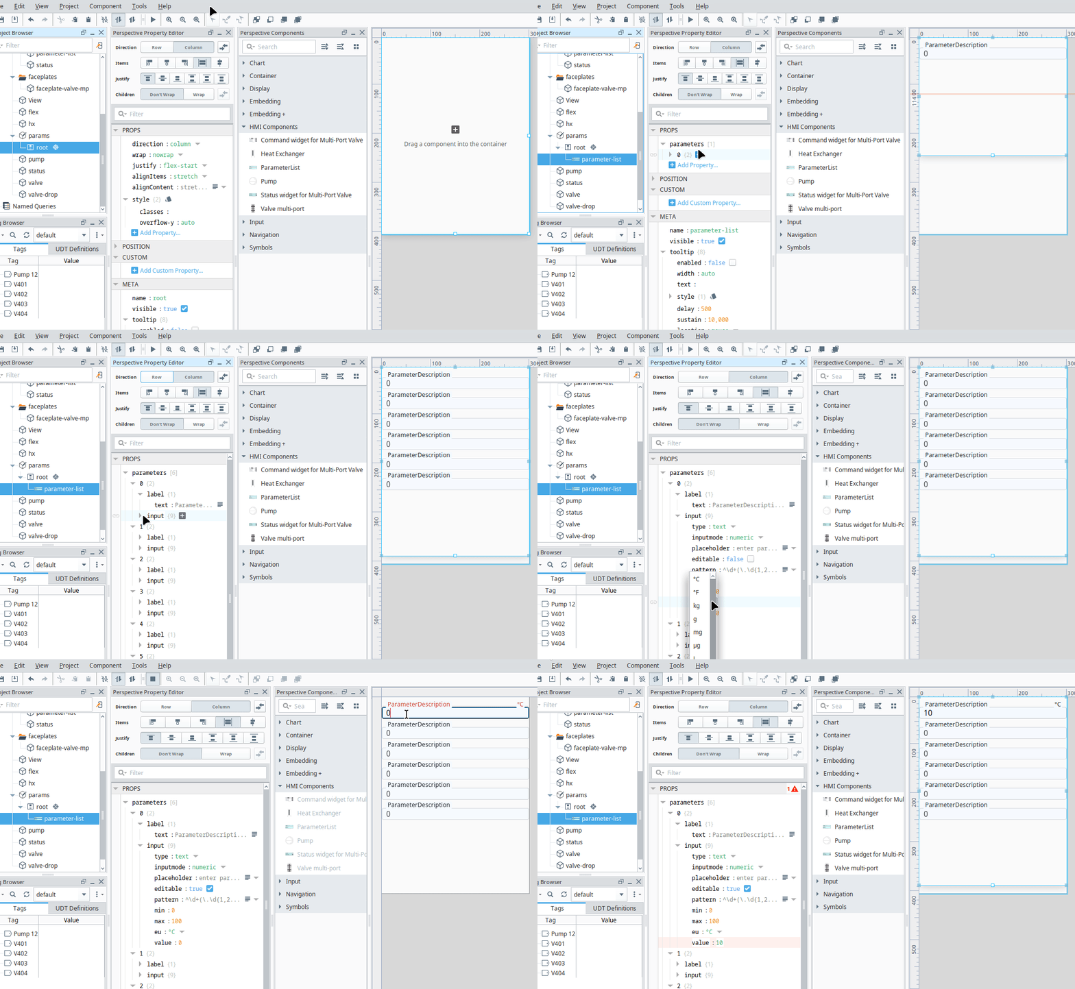
Parameter List

Component Palette Icon:
A component for parameter visualisation and authorised parameter entry. The appearence may be appropriately styled. Full menu of style options is available for text, background, margin and padding, border, shape and miscellaneous. You can also specify a style class.
Properties
Most Properties have binding options. For more information on Bindings, see Types of Bindings in Perspective. This section only documents the Props Category of properties. The other Categories are described on the Perspective Component Properties page.
| Name | Description | Property Type |
|---|---|---|
| parameters | A list of parameter objects | array |
| style | Sets a style for this chart. Full menu of style options is available for text, background, margin and padding, border, shape and miscellaneous. You can also specify a style class | object |
parameter Properties
| Name | Description | Property Type |
|---|---|---|
| label | Configuration of parameter label properties | object |
| input | Configuration of parameter input properties | object |
The label and input properties are attributes of the html tags <label> and <input>.
Further info on the html <input> and <label> tag can be found at mdn web docs website, with info for the OpenPropsUI Textfield Component at OpenPropsUI > Components > Input > Textfield site page.
label
| Name | Description | Property Type |
|---|---|---|
| text | Parameter Description | object |
input
| Name | Description | Property Type |
|---|---|---|
| type | A string specifying the type of control to display. Options are; - text - button - checkbox - radio - date - datetime-local - time - week | string |
| inputmode | A string providing a hint to browsers as to the type of virtual keyboard to display. Options are; - text - numeric - none | string |
| placeholder | Text string which appears when no input value is set | string |
| editable | If true the input field is editable | boolean |
| pattern | A regex pattern for browser side data validation. 💡 Note does not prevent entry of invalid data Suggestions are; - [0-9]* for integers - ^\\d+(\\.\\d{1,2})?$ for floating-point numbers with 1 or 2 decimal places. | string |
| min | Minimum value | string |
| max | Maximum value | string |
| eu | Displayed Engineering Unit | string |
| value | Parameter Value | number |
Component Events
The component supports the "Action Performed Event".
Further information regarding the Action Performed Event can be found a the Perspective Event Types Reference page. The Component Events and Actions page shows how to configure events and actions on a Perspective component. Component scripting is handled separately and can be accessed from the Component menubar or by right clicking on the component.