Heat Exchanger
Component Palette Icon:
A component that looks like a heat exchanger symbol. Full menu of style options is available for text, background, margin and padding, border, shape and miscellaneous. You can also specify a style class.
Properties
Most Properties have binding options. For more information on Bindings, see Types of Bindings in Perspective. This section only documents the Props Category of properties. The other Categories are described on the Perspective Component Properties page.
| Name | Description | Property Type |
|---|---|---|
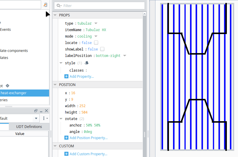
| type | Options for the appearance of the component. Options are: - plate - tubular | string |
| itemName | Item identifier | string |
| mode | Options for the appearance of the component. Dependant on mode of equipment. Options are: - alarm - i.e user attention required - cooling - Equipment in cooling mode - heating - Equipment in heating mode | string |
| locate | Enable locate animation | boolean |
| showLabel | Show item identifier | boolean |
| labelPosition | Options for the location of the item identifier label. Options are: - left - right - top-left - top-right - bottom-left - bottom-right | string |
Component Events
The component supports the "Action Performed Event".
Further information regarding the Action Performed Event can be found a the Perspective Event Types Reference page. The Component Events and Actions page shows how to configure events and actions on a Perspective component. Component scripting is handled separately and can be accessed from the Component menubar or by right clicking on the component.